
Hand Lettering- 5 Simple Tips to Get You Started Handing Lettering in Your Bible
Hand lettering has taken the world by storm.
Guest post by Neely Beattie
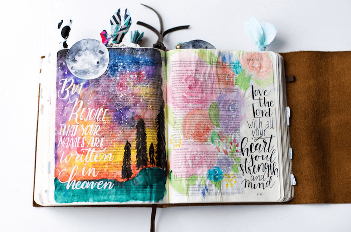
I am often asked if I use special pens to make the words on my Bible pages look the way they do. While there are special pens and markers to allow you to achieve the same look, I usually don’t use those in my bible. You CAN; I just normally don’t. I do have an entire post on supplies I love you can check out. Below is an example of the lettering I’m talking about.
This post contains affiliate links. At NO additional cost to you, we may receive a small commission from purchases you make. And, we REALLY appreciate it!
What I am doing in my Bible is called hand lettering (or sometimes called faux calligraphy). Hand lettering is different from dip pen calligraphy and brush pen calligraphy. These ARE done with special pens and markers, which I may go over in the future, but you can hand letter with supplies you probably already have around your house!
Today I wanted to give you a very basic overview on hand lettering. Hand lettering is a very popular way to add verses in an artistic way to your journaling bible pages, address envelopes, or even create pieces to give to friends and family as gifts!
Before we start, I want you to remember something. We are accustomed to writing a certain way our entire lives. Just think of how long you’ve been writing. Probably since you were about 5! That is YEARS of practice to get to where you are today in terms of how you write. You probably don’t even think about it anymore.
With that in mind, remember it will take some practice to get to a place where you’re happy with your hand lettering as well because we’re going to teach our hands to make letters in ways that they’re not use to. At first it probably won’t look the way you want. Don’t let that discourage you! I am confident that with practice you can do it.
Hand Lettering Tip 1: DRAW the letters, don’t write them.
If you just write the words, your normal handwriting will be sneaky and try to peek through the letters you’re making. A great way to practice drawing letters instead of writing them is to look at different computer fonts and practice drawing them.
Hand Lettering Tip 2: Try printing words out in fonts you like and trace them.
Once you find some fonts you like, print them out. You now have a template for tracing.
Here are some of my favorite fonts: Madina Script, The Bakery, Liberty and Love, Tokyo, Magenta Sans, Gingerbread and Cookies, Countryside Farmhouse Duo.


When you trace the letters you get a feel of the shapes of letters and all the different ways they can look, work, and move together. When you feel like you’re confident with that, you can try drawing them from just looking at the letters without tracing them. Eventually, the more you practice, your muscles will start to remember what you’re doing, and it will become a lot easier to draw the letters instead of writing them.
If you don’t want to create your own, check out these ready-made hand lettering worksheets in a variety of styles.


Once you get comfortable tracing the letters, get ready to for the next step!
Hand Lettering Tip 3: Practice with a guide sheet.
These pages are included in the Beginner's Guide to Hand Lettering. (You can also use graph paper to help you with this as well as the guide sheets.)
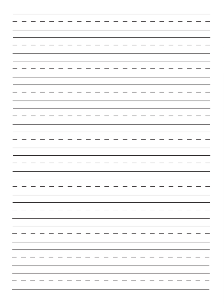

The reason I recommend a guide sheet is so you can make sure your letters are the same height and have the same angle as you’re practicing. If you practice incorrectly, you’ll get in the habit of making letters the incorrect way.

One thing that makes hand lettering look "beginner" is when your letters are angled in different directions. I have an example of that below. The guide sheet with slanted guides helps you avoid this.

These next videos give you an idea of what brush pen calligraphy looks like and then what the same letters/words look like when you hand letter them. For the first line, I am using the pen that I showed you in the first video. For the second line, I’m just using a regular pen.
Notice when I use the brush pen, the downstrokes on the letters are thicker. I achieve this by applying more pressure to the pen like I showed you in the first video. The upstrokes are thinner.
This is when I stopped applying pressure to the pen and made that stroke lightly up. So, that leads us to tip 4.
Hand Lettering Tip 4: Remember DOWNSTROKES are THICK. UPSTROKES are THIN.
The reason I wanted to show you the brush pen was so you would know exactly why the down strokes are thick and the upstrokes are thin. When I did the hand lettered version, first I wrote the word then I “manually" added a thickness to the down strokes and colored them in on each letter.

Hand Lettering Tip 5: Try holding your pen differently
When I first started hand lettering, I held my pen the same as when I would write and I wasn’t really satisfied with my results.
So, I started trying different ways of holding my pen and I found that it DID effect how I was able to draw my letters and after I got use to it, it actually made hand lettering (and drawing) EASIER
I wanted to show you how I normally hold the pen when I write and how I hold it when I hand letter.

This first image above is how I have held my pen my whole life. I’m a tight fisted, death grip writer, y’all. And I push down HARD. I have had to completely change this with hand lettering.
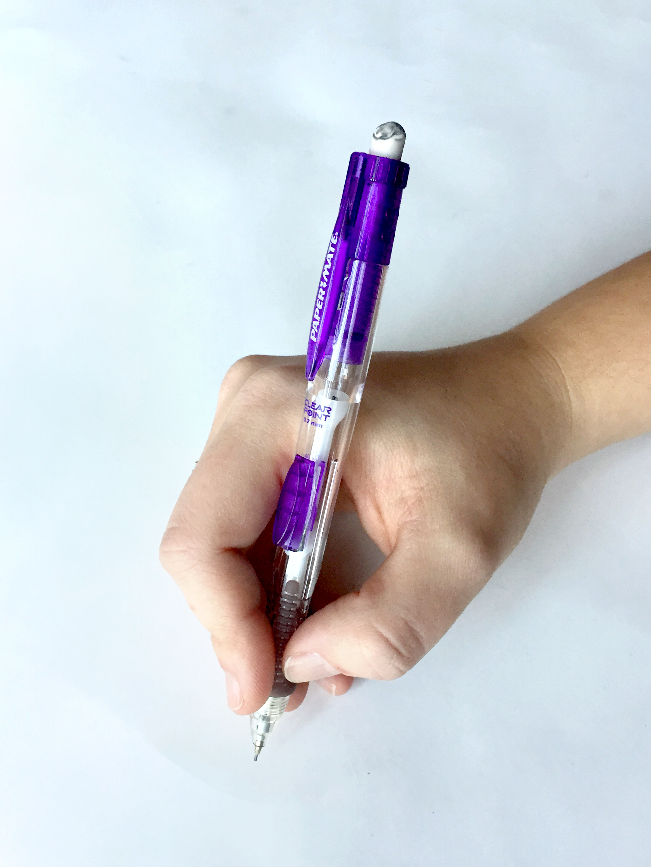
In this next picture, notice how I’m holding the pencil with a lot lighter grasp. I’m not even really grasping the pencil, but it’s kind of laying on the side of my knuckle. My index finger is lightly laying on top of the pencil and my thumb is lightly placed on the side.
Here are a few things I realized when I started holding my pen differently:
When I lighten my grip if have found that I have more control over what my letters look like by flexing my fingers and wrist to make the shapes.
When I’m holding my pen like I “normally do” I can’t draw the letters correctly because my natural handwriting seems to want to be in control instead of me.
I also found that when my hand is gripping the pen so tight, I can't make good motions to shape the letters. All my letters were short and fat and I didn’t have a good range of motion in my fingers to change the shapes.
And last, this is pretty much the only way I have found that works for me when I want to do brush lettering or dip pen calligraphy, so I wanted to get in the habit of holding my pen this way. For the future, you might want to get into this habit, too. ;)
A side note: If you’re having issues with your lines being shaky when you go back over your sketches in ink (at the risk of sounding contradictory) try holding your pen tighter, maybe even your regular way of holding your pen.
A lot of the time when I’m going over my sketches in ink, I hold the pen tighter because I feel like I can hold it more steady that way.
But, this is important, I DON’T press down hard when I put pen to paper, I ONLY tighten my grip.
Holding your pen isn’t a science. What works for me might not work for you. Especially if you’re not a death gripper like I am. However, I do think that holding your pen differently, whether it’s exactly like I do or not, might help you draw the letters instead of writing the words.
As with anything, I encourage you to experiment and find what works for you! :)
So, that’s it! Write your words then go back and make the downstrokes thicker. It’s pretty simple!
I hope you found these tips helpful!


